Resurface Labs
My Role:
I lead and conducted most of the research including usability testing, user interviews and synthesis of data. I also contributed to new design efforts along with the team.
Overview
Resurface Labs is a company that focuses on API monitoring software and is wrapping up their early stages as a startup. Their current website was targeted towards investors but now they want to attract potential customers.
Our challenge was to redesign the Resurface Labs website to increase customer acquisition from their two main users: DevOps and mid-to-high level managers.
Research & Synthesis
1) Affinity Mapping
We started by interviewing the primary user base of Resurface Labs: mid to high level managers and DevOps. Our goal was to get an insight on what they look for when adopting a new software product and their experience throughout the software adoption process.
The affinity map shows the compiled quotes from each interviewee into similar groups which were then formed into "I" statements.
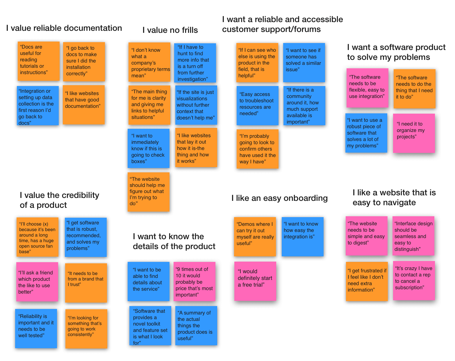
Main Takeaways —
“I value reliable documentation”
“I value essential, no frills information”
“I want a reliable and accessible customer support/form”
“I want a software product to solve my problems”
“I value the credibility of a product”
“I want to know the details of the product”
“I like an easy onboarding”
“I like a website that is easy to navigate”
Research & Synthesis
2) Competitive Analysis
The next step in our research was to perform a competitive analysis. I started comparing features of Resurface Labs to similar software product websites that people trust and have an established user base. The competitors included: Vercel, Platform.sh, Visual Studio Code, Atom.io and GraphQL.
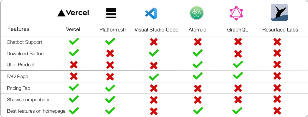
I listed the features that were commonly found on the competitor websites such as Chatbot Support, FAQ Page and Pricing. Resurface Labs’ current website contained none of those features, which would not align with what our interviewees said about acquiring a reliable and credible product.
User Personas
Who are we designing for?
After conducting our interviews we developed two user personas who would represent the main user base of Resurface Labs.
Persona #1
John, DevOps Engineer
“A software that helps me do my job efficiently is important to me.”
Behaviors ✍️
Constantly looks to improve workflow
Browses the web to troubleshoot issues
Checks product documentation to further troubleshoot issues
Rushes to meet deadlines
Needs & Goals 🎯
Solve problems efficiently to continue working through roadblocks
A detailed summary of product & comparisons of features
An internal forum or reliable user support
Documentation for troubleshooting
Pain Points 📍
Has a hard time finding a solution to software issues
Companies’ proprietary terms are confusing
Doesn’t have time to schedule a consultation
As a DevOp, John would potentially be working with Resurface Labs’ application almost daily if his team decides to integrate it. Our interviews showed that developers prioritize efficiency and reliable documentation to refer to while solving out issues. Developers also like to see how a product can easily integrate with their current workflow and avoid unnecessary information when possible.
Problem statement: John needs a way to find documentation easily when troubleshooting because it will help him work more efficiently throughout the day and get tasks done in a timely manner.
Solution: This task flow shows how John would carry out the task of finding documentation on the new Resurface Labs’ website- we chose to create this flow since this is a task that would be repeated the most.

Persona #2
Vicki, Operations Manager
“I want a software that helps our team function at the best level possible.”
Behaviors ✍️
Actively inquires about new integrations for her team
Tries free product demos
Values business and team goals equally
Needs & Goals 🎯
Easy ways to learn about products that aren’t time consuming
Products within budget that align with team goals
Pricing options and feature comparisons among products
Pain Points 📍
Hard to communicate and reach out to product support teams
Lack of transparency in promotional websites
Difficult website navigation
After conducting interviews with individuals in managerial roles we understood that managers don’t like to spend an excess amount of time inquiring about a new integration and want to see clear examples of how the product would benefit their team.
Problem statement: Vicki needs a way to quickly inspect whether a software will align with her team in order to complete projects and meet company goals in the most efficient way possible.
Solution: As we our interviewed our user group, we found that most managerial level individuals would try a free demo if it is offered on the website. Vicki’s task flow shows how she would schedule a free demo by browsing through the product page.
Restructuring the Sitemap
The original sitemap of Resurface Labs’ website contains Product, Docs, Blog and About on the header. Our user research showed that John would be accessing Docs most and Vicki would be accessing the Products page. I restructured the sitemap so that the new header would have Products, Docs, and Contact, and the remaining navigation items would live in the footer. This was done to add more attention to Products and Docs and to simplify the homepage design as a whole.
Ideation
Style Guide
The Resurface Labs team preferred to keep the branding, logos and colors as close to the original style as possible. We aimed to give it a cleaner and more modern look, incorporating a lighter shade of blue as the primary color and brighter accent colors like green, orange and yellow.
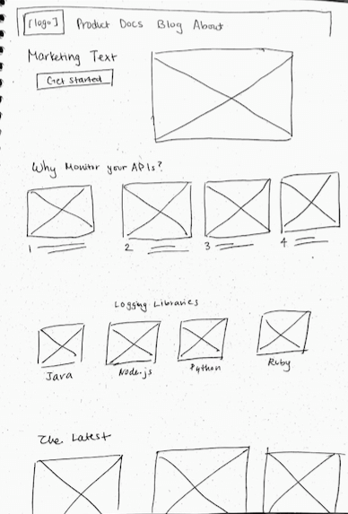
Some sketching . . .
Design Solution
The original Resurface Labs website was designed in mind for investors and stakeholders during the early stages of the startup. My team and I created a new look that would guide the potential customer base in meeting their specific needs.
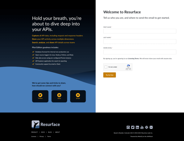
Original Design
The original website contains a lot of block text which is overwhelming for users who are browsing
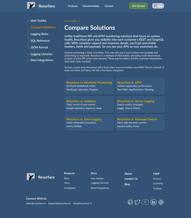
There are no breadcrumbs while navigating through the website which may confuse users & lead them astray
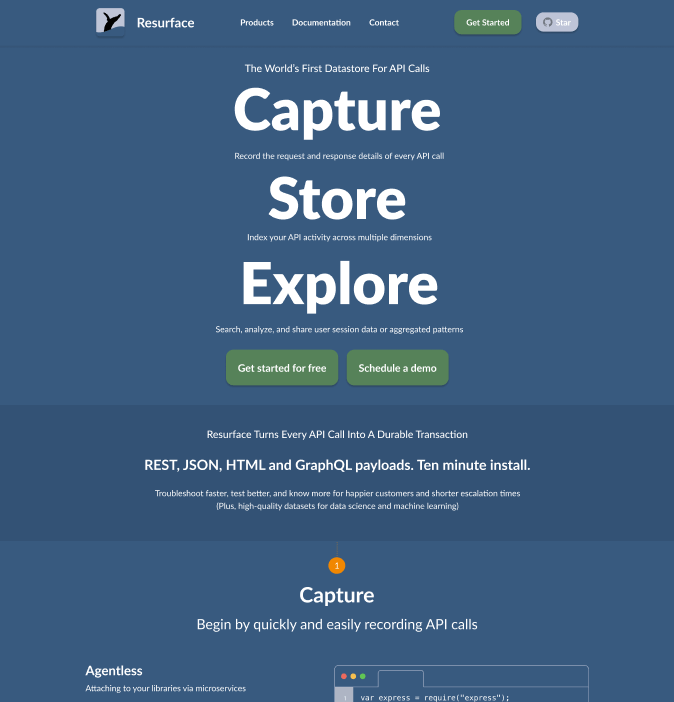
The Docs page is displayed by a grid layout
The Product page does not include any of the packages offered and only the features
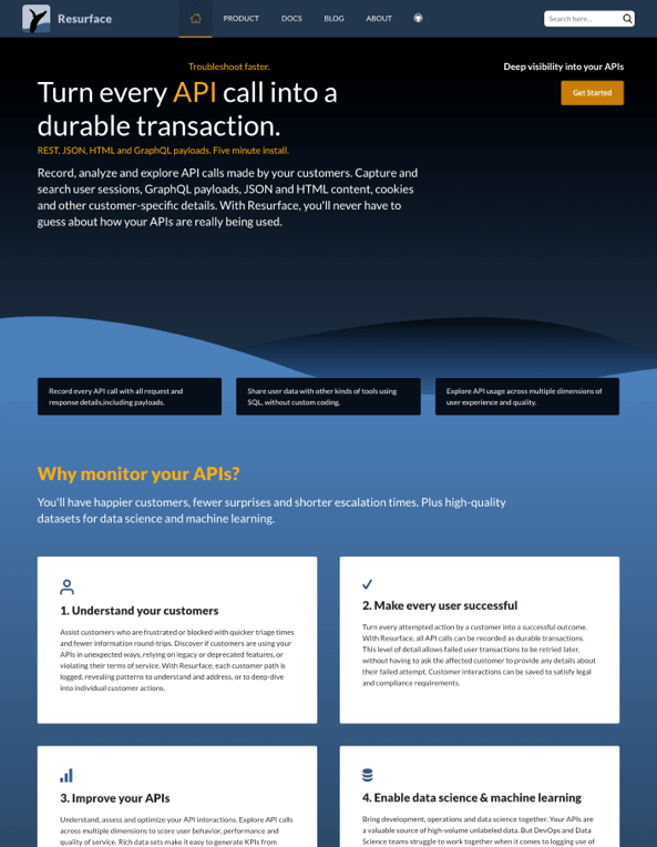
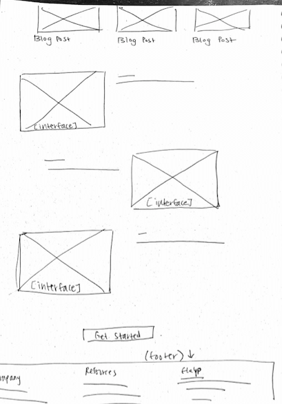
Original Homepage
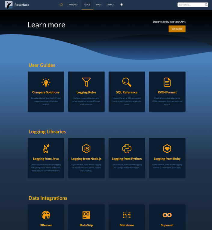
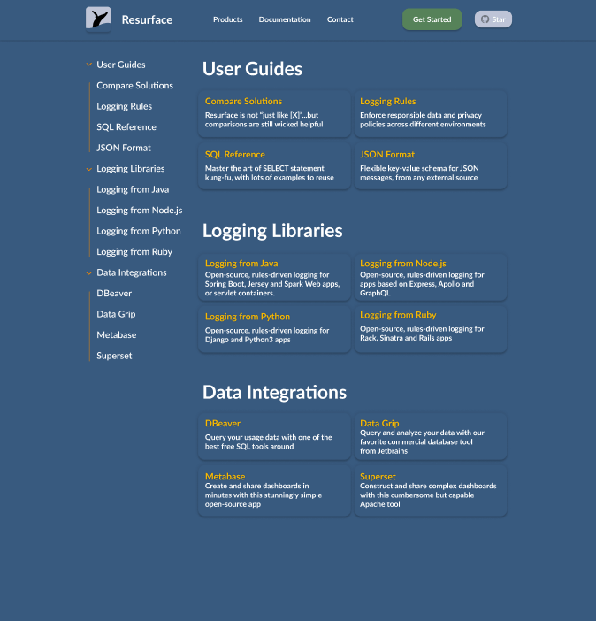
Original Docs page
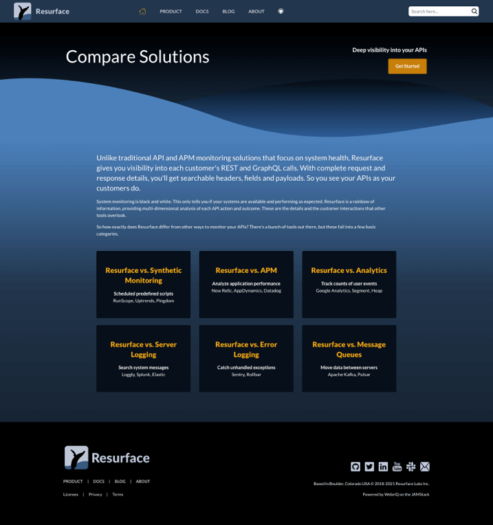
Original Compare Solutions page
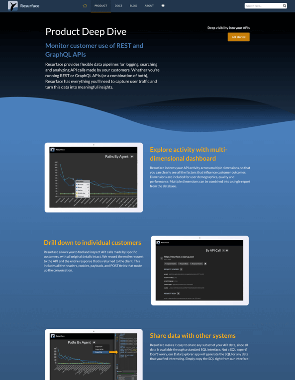
Original Product page
Original Demo page
New Design
We condensed the homepage and highlighted the main features of the product by showing examples of how the product works
A side navigation menu was added to the left side of Docs to easily view contents of the page without the user having to scroll down
Breadcrumbs were added when navigating to the Compare Solutions page- this helps the user go back to documentation and see how they’ve navigated their current page
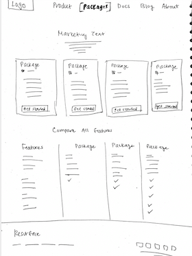
I designed a product chart showing the differences in features of the packages
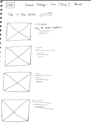
New Homepage
New Docs page
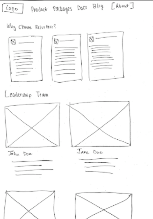
New Compare Solutions page
New Product page
New Demo page
View the full prototype
Usability Testing
I came up with a list of questions and tasks for participants to perform. The purpose of usability testing was to see if our new website design was functional and intuitive for our main users. We wanted to see if tasks were successful in being completed, observe the usability of the website and understand how users felt while navigating.
Some questions asked during testing —
Show me how you would select a product package
Show me information on how to log from Node.js
How was your experience finding information on the product?
Were there any points of confusion?
Testing Results —
I gathered similar quotes from each of the interviews and grouped them into categories. Each of the categories were then synthesized into “i” statements representing how the users collectively felt.
Main Takeaways —
“I think the documentation page looks overwhelming”
“I don’t think the Github logo will be recognizable for non-devs”
“I can’t tell the differences between the product packages”
“I want to see logos next to the logging libraries (in Docs page)"
“I need the header to be static”
Design Iterations
After conducting usability testing on the new design we gathered some important feedback from our interviewees to incorporate into the website. Our prior research showed our main users’ needs while this feedback would shape the design of how those needs would be better achieved.
Documentation Page
Problem: Many users felt overwhelmed by seeing mostly text on the page and spent time reading through the different libraries. When prompted to find information on logging Node.js, users were carefully browsing the page to find it.
Solution: We added logos next to the logging libraries to make them easily identifiable when landing on the docs page. We also increased the size of the text on the header for better readability and made the white body text bold for users to see clearly.
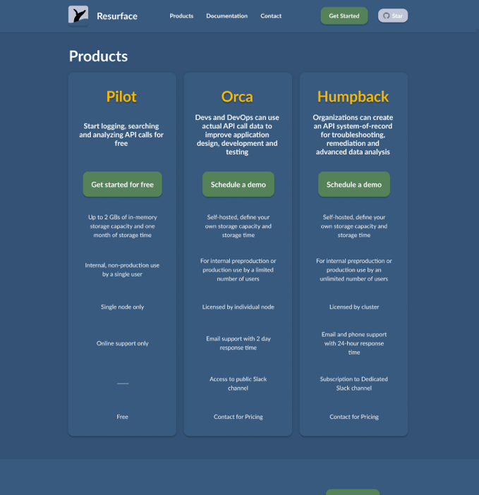
Product Page
Problem: Users had difficulty finding the differences between the product packages at first glance. The Resurface Team preferred shorter descriptions for their packages to not overwhelm the user.
Solution: I designed a low-fidelity mockup of the pricing page showcasing the packages in a card layout. The cards highlight the key differences between the packages which are the storage capacity and the number of users allowed access.
If the user wanted to see the full features of the product packages they would scroll down and view a feature inventory of the individual products. This would resolve the issue of not overwhelming the user with excessive content.
Conclusion & Next Steps
It was definitely a journey working on a new website design especially for a new startup. I learned how to work alongside clients and meeting their needs as well as conducting the UX process and meeting the needs of the users. Most importantly I learned how to effectively communicate my research with stakeholders in a way that made sense and created value to the business.
Assess the impact of the new design by testing with users using qualitative and quantitative metrics
Create a high-fidelity version of the product page and conduct a usability test to see which version is more successful
Revamp product UI to match website design
Add a community form for developers